Jackson Pollock's "Random" Paint Blotches Are Genius-Level Physics
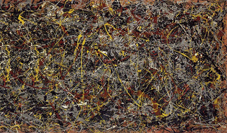
In 2006, Jackson Pollock's painting No. 5, 1948 was sold to an anonymous buyer for around $140 million.Pollock is the poster boy for art that looks like a bunch of paint blotches. The reason being that his paintings are a bunch of goddamn paint blotches.
But Actually ...
Fun fact: There's software which can tell a real Pollock painting from an elaborate forgery. How the hell is that possible? Because Pollock's work contains fractals: infinitely complex, never-ending mathematical patterns that are specific to his work. While everyone thought he was merely dripping paint everywhere randomly like a drunken contractor you hired on Craigslist, he was in fact creating entire worlds.
So how do we know the fractals aren't there by accident? Well, the later the Pollock painting, the richer and more complex the patterns, and thus the greater its fractal dimension. And there are even more mysteries hiding in his work. It appears that Pollock took advantage of an area of fluid dynamics scientists have only recently thought to study. This phenomenon is called "coiling," and you've experienced it while dripping honey, except no one gave you millions of dollars afterward. It's when thick fluid falls onto itself in the form of coils, similarly to rope, and creates patterns that can be described by a mathematical equation.
↓
Continue Reading Below
Anyway, in order to control the coiling, Pollock used a rod to drip
the paint onto the canvas instead of pouring it straight from the can or
using a brush. By mixing paints of various densities and moving his arm
at different speeds, he was able to control the patterns that would
show up in the final painting. Dude was doing high math and making it
look like a stoner playing with finger paint.
5
Mark Rothko's Colorful Blobs Are Made Of Hundreds Of Meticulously Mixed Layers
If you've never heard of Mark Rothko, here are two of his most famous paintings, Black On Maroon and Orange And Yellow:If it pisses you off that those things sell for millions while you're making $9 an hour at McDonald's, we can't blame you. Hell, most of us were cranking out Rothkos by the hundreds in our youth until we moved on to the more challenging stuff, like trees or stick figures. This guy probably put as much effort into making those paintings as he did into naming them, right?
↓
Continue Reading Below
But Actually ...
First of all, Rothko's paintings were a lot bigger than a Google Image search thumbnail would suggest ...
 Albright-Knox Art Gallery
"That's right. My paintings are so big that they only fit on your mom's fridge."
Rothko would go to extreme lengths to get a certain tone. He'd do
everything possible ... except use the actual color of paint, that is.
One of his techniques was to create differently-colored squares using
the exact same pigment. He'd apply a bunch of layers on top of one
another in varying amounts, creating different hues. Another involved
layering various colors to create a completely different one -- Black on Maroon up there, for example, is more like Ultramarine Blue On Maroon On Blue-Black On Brown-Black On Etc., but that's a way less catchy title.
Rothko's layers were so thin that you can see what's underneath in some spots, or under very bright light. It's like you're looking at dozens or even hundreds of paintings at on top of each other. Presumably, when somebody first pointed out that you could simply buy "black" paint at the craft store, he went on a killing rampage which continues to this day.
First of all, Rothko's paintings were a lot bigger than a Google Image search thumbnail would suggest ...
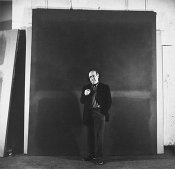 Albright-Knox Art Gallery
"That's right. My paintings are so big that they only fit on your mom's fridge."
Albright-Knox Art Gallery
"That's right. My paintings are so big that they only fit on your mom's fridge."Rothko's layers were so thin that you can see what's underneath in some spots, or under very bright light. It's like you're looking at dozens or even hundreds of paintings at on top of each other. Presumably, when somebody first pointed out that you could simply buy "black" paint at the craft store, he went on a killing rampage which continues to this day.
4
Those Crude Caveman Hand Prints Were Made By Inventing Ancient Spray Paint
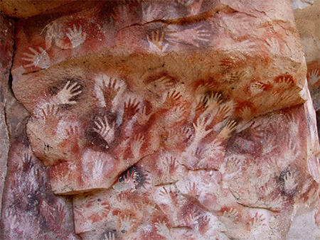
Much like toddlers, cavemen during the Paleolithic era seemed to think that the best forms of self-expression were 1) drawing crude animals on the wall, and 2) just fucking leaving your hand prints everywhere.
↓
Continue Reading Below
That's like remedial art. You press your hand against a surface and
paint around it. Even back in kindergarten, we were bringing that stuff
to the next level by turning our hand prints into fat turkeys and
deformed stegosauruses.
But Actually ...
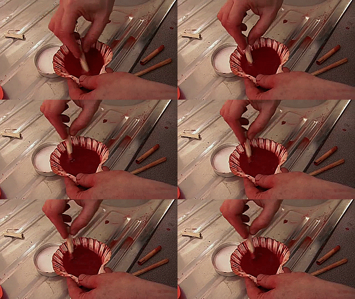
If you look closely, you'll notice that the hands above aren't really painted; they're stenciled. And since spray cans wouldn't be invented for a few dozen millennia, the cave people had to invent a complicated process to create that effect. In the first step, the troglodyte artist mixed a special watered-down pigment, ensuring it had a runny quality. Next, using a bivalve shell to hold the paint, they would insert a hollow bone into it like a straw.
Then the artist held the shell close to the wall while using a second bone/straw to blow across the first.
This created a vacuum which sucked the pigment from the shell and redistributed it in spray form, making a cloudy splash of color around the hand. Blowing the pigment this way quickly resulted in lightheadedness, which means that the association between art and getting messed up goes back way further than we thought.
3
Andy Warhol's Campbell's Soup Repetitions Were Individually Painted In Detail
↓
Continue Reading Below
Andy Warhol's best known piece is a copy/paste job of the exact same soup can:
It looks about as hard as photocopying your butt with the office copy machine, but it doesn't require nearly as much flexibility or cunning. It's no secret that Warhol specialized in screen printing, wherein a stencil allows the artist to crap out as many copies of a painting as they want. So all Warhol had to do here was put paint the same stencil over and over again.
But Actually ...
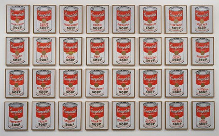
Take a closer look at those paintings:
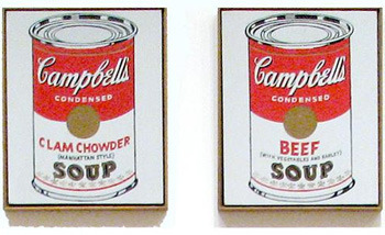
It's not the exact same can -- every one is a different flavor. The Campbell's Soup series marks the transition in Warhol's career between painting by hand and using the mass production process. Before he went full-on Terminator, Warhol painted everything himself. He bought cans at the supermarket, projected them onto the canvas, and carefully painted within the outlines.
 Bob Adelman
Andy Warhol buying groceries like a "regular male human" is the most intensely creepy thing we've seen.
Only the contours of the cans and the highlights of the words "Campbell's" and "Soup" were screen-printed, while the fleur-de-lis pattern was hand-stamped. He filled in and lettered the 32 different cans by hand. To complicate matters, there is another Campbell's Soup series
which was screen-printed in its entirety, but this was made a few years
later. Warhol even hired a screen printing house for that one, leaving
him extra time to concentrate on his true passion of becoming as
off-puttingly weird as possible.
It looks about as hard as photocopying your butt with the office copy machine, but it doesn't require nearly as much flexibility or cunning. It's no secret that Warhol specialized in screen printing, wherein a stencil allows the artist to crap out as many copies of a painting as they want. So all Warhol had to do here was put paint the same stencil over and over again.
But Actually ...
Take a closer look at those paintings:
It's not the exact same can -- every one is a different flavor. The Campbell's Soup series marks the transition in Warhol's career between painting by hand and using the mass production process. Before he went full-on Terminator, Warhol painted everything himself. He bought cans at the supermarket, projected them onto the canvas, and carefully painted within the outlines.
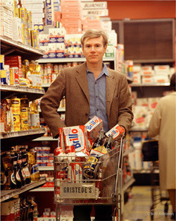 Bob Adelman
Andy Warhol buying groceries like a "regular male human" is the most intensely creepy thing we've seen.
↓
Continue Reading Below
2
Yves Klein's "Blue" Was An Entirely Unique Invention
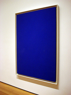
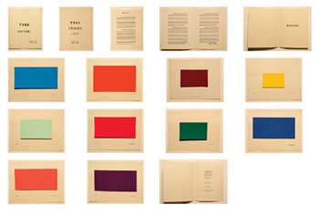
Behold a painting by Yves Klein, one of the most famous figures in postwar European art:It's certainly a nice shade of blue ... but that's all there is. There's no hidden layer or optical illusion here; the work is nothing but a canvas painted blue. It's not a singular occurrence, either. At one point, Klein held an exhibition of 11 of his works, all of which were canvases painted the exact same blue. The guy was either super lazy, a huge troll, or just had a shitload of excess blue he wanted to get rid of.
But Actually ...
That particular shade of blue was the result of an insanely difficult process. The whole thing began when Klein published a book of monochrome paintings, which he exhibited at public showings. The audience, however, interpreted the work as a showcase of different bits of interior decoration.
↓
Continue Reading Below
A bit miffed that his artistic manifesto had been mistaken for an
IKEA catalog, Klein decided to take monochrome painting to a new level
-- namely, by inventing a new color. His International Klein Blue is a unique, brilliantly luminous shade of blue ... which you'll probably never witness
unless you get to look at a Klein painting in the flesh. See, when
artists' paints are made, the pigment is mixed with some kind of binding
medium, which has a tendency to dull the color (which, in turn, makes
it easier to reproduce in screens or print). Klein wanted a blue that
would never lose its glow, and after much experimentation, he finally
found an art shop which sold a special type of binding material
(Rhodopas M60A) which allowed him to mix the perfect shade. Then some
heathen came along and said, "I don't get it, it's just blue," and
Klein's head exploded in the most luminous shade of red.
1
Ancient Egyptian Drawings Were Constructed Proportionally On A Mathematical Grid
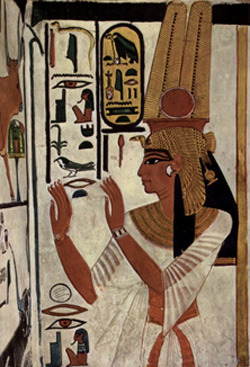
Here's a typical ancient Egyptian portrait:
It's kind of pretty in a stylized and iconic way, but it doesn't seem all that technically impressive. The ancient Egyptians are known more as engineers, not artists, which might leave you a bit cold in the gallery, but at least their college degrees were worth something, dammit.
But Actually ...
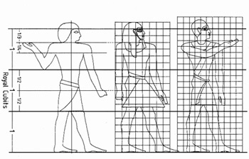
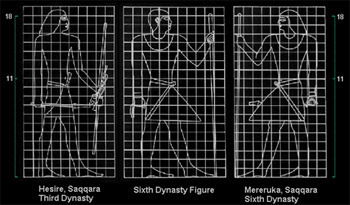
They were both engineers and artists, even bringing the former to the latter. First, they had to draw up a grid, dividing the work surface into parts of equal proportions. Only then could they start figuring out where to put each body part, all of which had to take a specific number of squares (presumably to prevent the occurrence of Rob Liefeld feet). Different kinds of figures were to be specific sizes -- a standing figure, for example, always had to occupy 18 squares from the feet to those sexy lined eyes.
Just for laughs, the grids were usually changed around when a new dynasty came to the throne, but they were always highly specific. Under the rule of the Twelfth Dynasty, every single body part had its assigned place, from the hairline to the line of the lower buttock (the two were to be nine squares apart in a seated figure, as the gods intended). There was even a specific line that had to run through the nipple, marking the invention of nipple piercing long before your father was disappointed in you.
There was also a whole other set of rules dictating what percentage of which body part had to go in which square. As you can see from above, for instance, during the Sixth Dynasty, an erect dong was to be exactly 4.5 squares long, no matter what the long-haired guy on the right insisted.







No comments:
Post a Comment