‘+81 magazine’ cover design by lo siento
spanish graphic design studio lo siento conceived the cover for japan’s +81 magazine, where the artist injects bubble wrap blisters
with colored water to spell out the issue’s subject ‘next creativity’. the work is amongst a diverse range of typographical explorations –
moving beyond the traditional realm of 2D to design for various identities and projects. ’4D type’ is one concept that sees the idea
of lettering to become viewable from all angles, or ‘empo’, which is an alphabet created as part of an identity for an osteopathy
office informed by the human body.
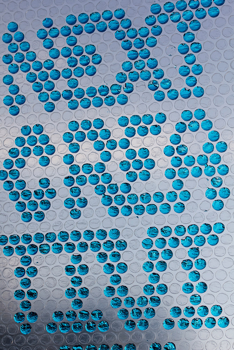
the artist injects colored water into the blisters to spell out ‘next creativity’ – the subject for that months issue

promotional example of the concept

process image of the bubble wrap typography
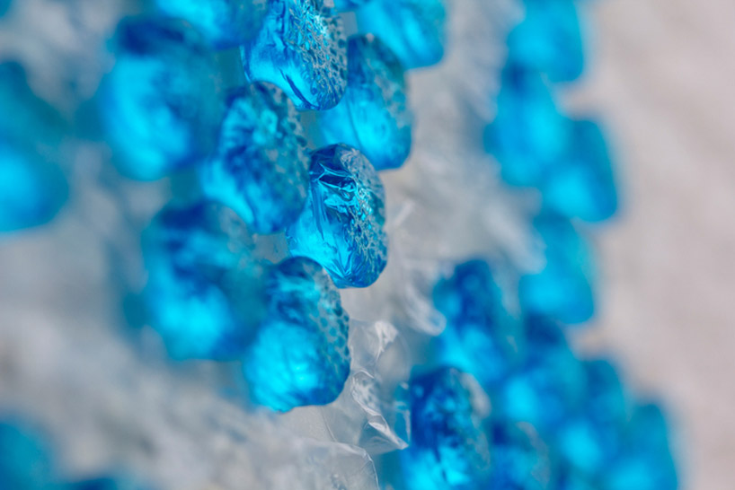
detail image of the filled blisters

the final outcome of the cover design

‘empo’ typography design – informed by the human body
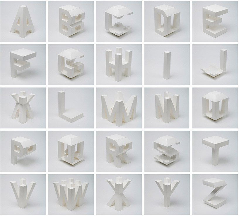
’4D typography’ – a type that can be seen from all angles

the lettering design is the result of intersecting, in an orthogonal way in space, two extrusions of the same character

the type can be read from minimum two different positions

album cover art for the band ‘pinker tones’

the design is created from carefully layered acrylic

the work creates a candy-like aesthetic

the piece spells ‘live in stereo’